Drop #470 (2024-05-21): Typography Tuesday
Interactive Type Tutorial; A Variable Fonts Primer; Featured Font: Amstelvar
Interactive Type Tutorial

As with most skills, it takes practice to become a proficient typographer. Said practice usually works best if you have the opportunity to learn from the work(s) of others. In typography, it may be possible to glean those insights from printed or online creations themselves, but it certainly helps to have someone point out the "why" certain choices were made in the composition.
It'd be great if we each had direct access to a master typographer, but that's not really feasible. I mean, they have their own work to get done, too! Thankfully, we can lean on technology to at least help us master the basics, and this "Interactive Type Tutorial" is spiffy teaching tool that will provide both the "how" and "why" for various typesetting choices that are appropriate in both online and printed contexts.
You start with some ugly unstyled semantic HTML text from the opening paragraphs of Greg Egan’s sci-fi novel Diaspora, and work through exercises on letter spacing, line spacing, font choice, and more. Each step has helpful annotations, and you get to see your tweaks in real time.
It's executed well, doesn't take a ton of time, and you'll come away type-smarter than you were before.
A Variable Fonts Primer
Longtime readers of these TT Drops know I'm a big fan of variable fonts. They are super flexibile/tweakable and far more compact than shipping a dozen TTF/OTF/WOFF files with a website. While we can use CSS to dynamically adjust their properties, it does require knowing those specific incantations.
"A Variable Fonts Primer" (GH) lays bare the inner workings of variable fonts, and covers how we can use them in user interface (UI) design, accessibility, and long-form reading.
In a UI context, variable fonts let us seamlessly transition between different styles, weights, and widths. They can help improve consistency how we design UIs and help make what build more responsive to the rectangle (or goggles) the human experiencing the UI is using.
In terms of accessibility, variable fonts give us the ability to make fine-grained adjustments to font parameters like weight, width, and optical size. This helps us optimize the content for legibility and reading comfort. Done well, this customization can be tweaked to meet the needs/preferences of each human experiencing what we make. This is especially helpful in long-form text contexts.
This spiffy primer both teaches us about variable fonts and showcases their utility. The site itself was built around Roboto Extremo, a "newly reimagined variable font currently in development", a variable font you can grab for yourself and start experimenting with. You also get to play with various aspects of this font in interactive blocks in various sections of the site.
Unlike the tutorial in the first section, you'll want/need to set aside some time to pore over this site to get the most out of it.
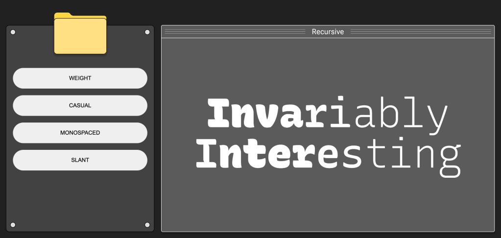
Featured Font: Amstelvar

Amstelvar is an experimental 17 axis variable font that was commissioned by Google back in 2017 to help show what's possible in this brave new world of variable fonts. It's a serif typeface inspired by the typeface designs used in the Netherlands and Belgium from the 16th century to the development of Times Roman in the 1930.
You can machinate the various variable font features here or here.
It's free for personal and commercial use.
FIN
Remember, you can follow and interact with the full text of The Daily Drop’s free posts on Mastodon via @[email protected] ☮️